Rebranding for @BlendInspire
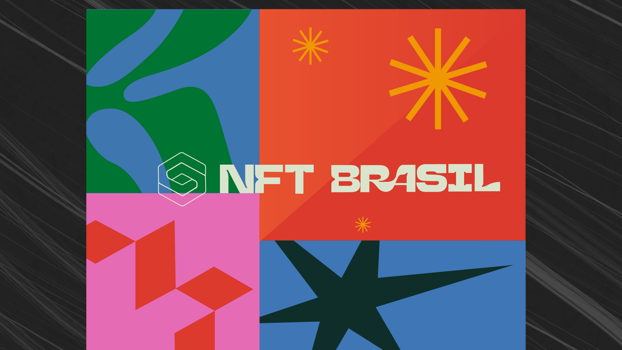
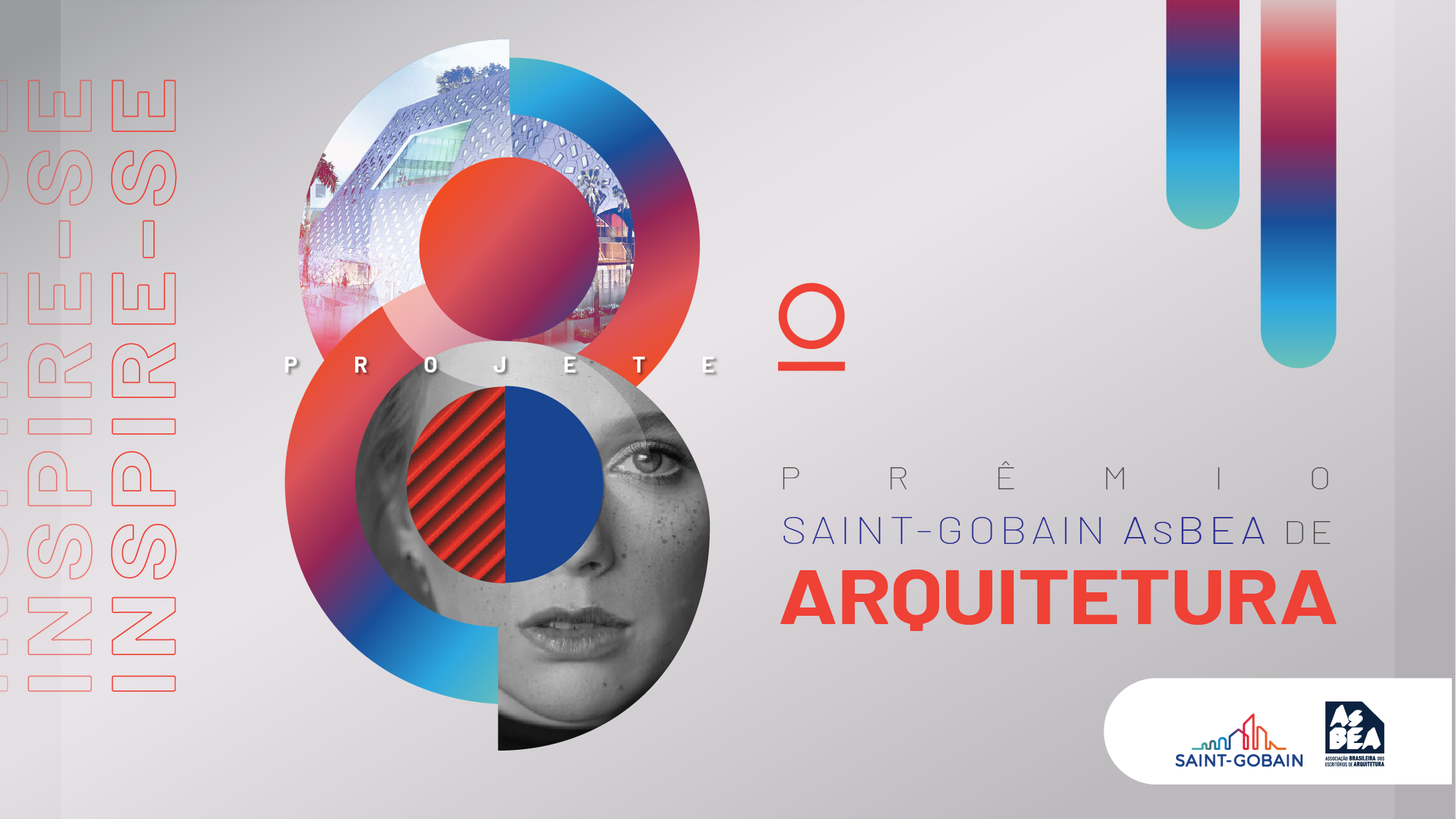
It was designed to convey more vivacity and plurality through vibrant colors, a nod to the 80s and 90s.
The basic and solid geometric shapes are in line with the design trend of simplifying elements, inspired by the Bauhaus school.
The font brought a more feminine air, more rounded shapes, at the same time bold with a retro reference.
The basic and solid geometric shapes are in line with the design trend of simplifying elements, inspired by the Bauhaus school.
The font brought a more feminine air, more rounded shapes, at the same time bold with a retro reference.
